Learn by Playing: Property Pursuit
Objective
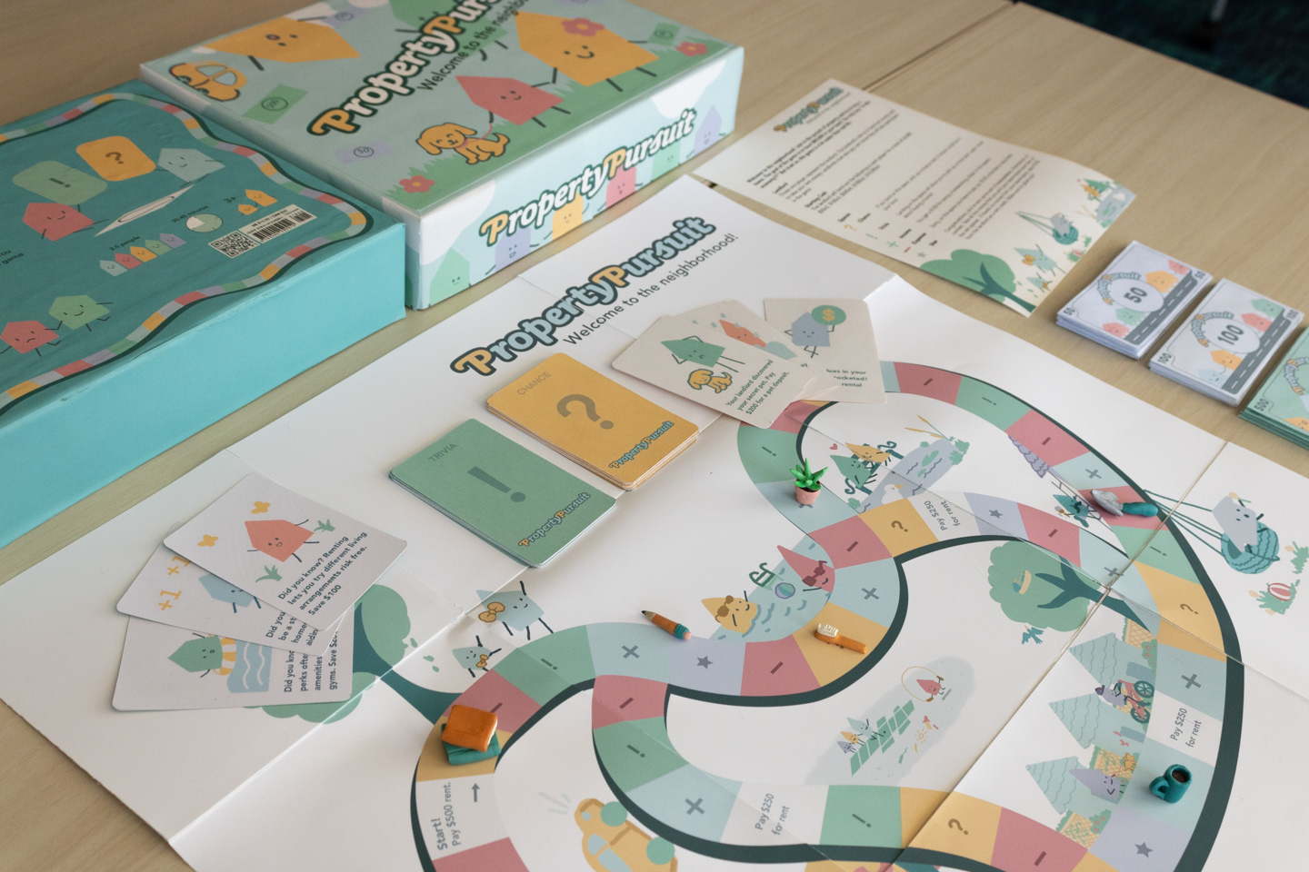
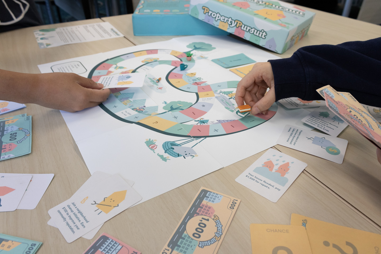
Create a game board with the topic "Property Pursuit". The design team is responsible for content research, all visual components to final game mock-up. The goal is to educate the audience through playing the game. Property Pursuit is an all ages board game aimed at educating players on the differences between purchasing a home or renting housing. The player uses two, six-sided die to move along the board and gain more money through trivia and chance cards. There are spaces allotted to cause the player to lose or gain money as well. To win the game, the player must have $80,000 cash in hand to purchase a home.
Dimensions
Game (unfolded) 20” x 20”; Game (folded) 8” x 8”; Box 8” x 11” x 2”; Cards 2 1/4” x 3 1/2”; Money 4 1/2” x 2”;
Game pieces 1/2”- 4/5”
Game pieces 1/2”- 4/5”
Team Designers
Rocha Flores-game board design, design for sides of the box, legend, color palette
Wanlin Guan-trivia and chance cards, design for box lid
Brilliana Gunawan-team leader, game board design and construction, sculpted game pieces, box construction and wrapping, rule sheet, logo design
Quyen (Tracy) Huynh-money design and construction, design for bottom of box.
Logotype

Finalized Logotype
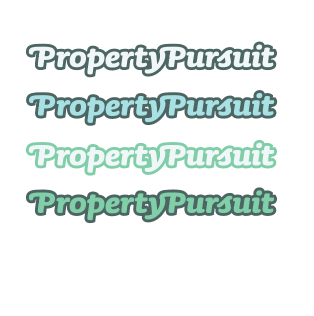
First Iteration, Experimentation with color palette
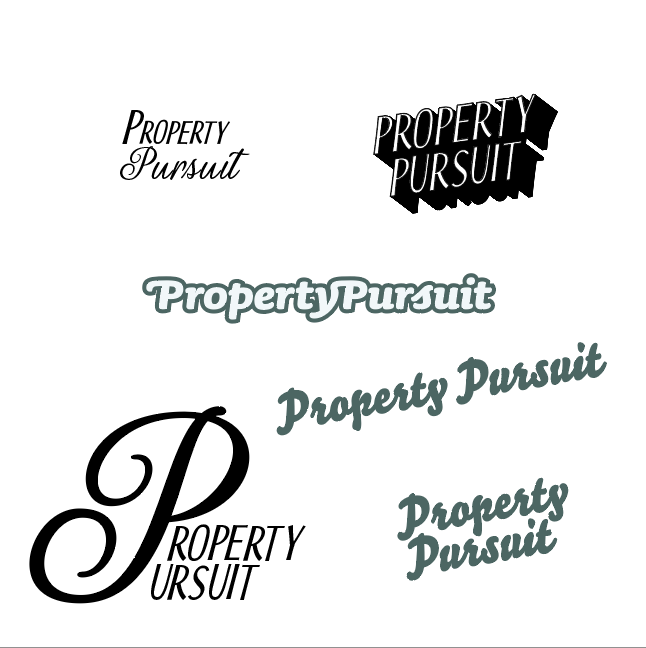
Experimentation
Design Process
Research and Logotype
We started this project through researching, comparing and contrasting the benefits and disadvantages of purchasing a home or renting housing. Based on this data, we created copy to be used on our twenty-four trivia and chance cards.
The next step was to develop the logotype and the color palette. By researching game development companies, we found that a logotype would be a memorable way to express the title of the game. A thick, bold outline and a warm accent color were used to create dimension, invoke a softly playful attitude, and to call out the alliteration in the game's title.
Game Pieces
Next, game pieces were created through polymer clay sculpting. At the beginning of this stage, the color palette had not been fully developed and the group had considered using animals to represent the players. As more progress was made, Wanlin had created the illustration style of using a pastel brush to digitally illustrate houses as characters for the chance and trivia cards. Due to the memorable quality that these characters had, we decided to move forward with using household objects to represent players. The colors were hand-mixed to resemble the color palette we had chosen, with some minor variations due to the nature of the craft and appearance of the objects.
An arrangement of game pieces designed after household objects: a short stack of books, a gardening trowel, a coffee cup, and oven mitt, a houseplant, a toothbrush, and a pencil.
Game Board, Game Board Construction, Instruction Sheet
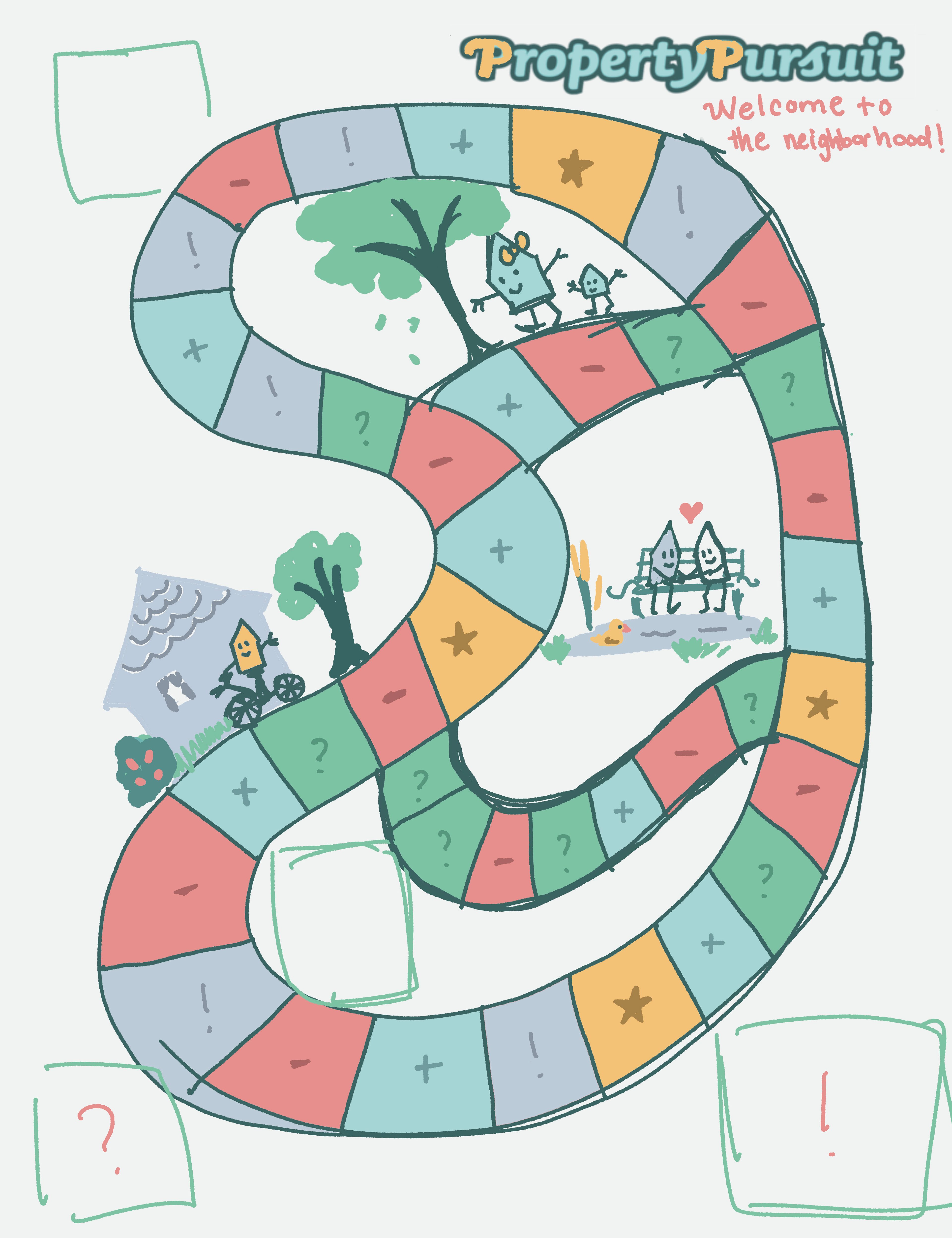
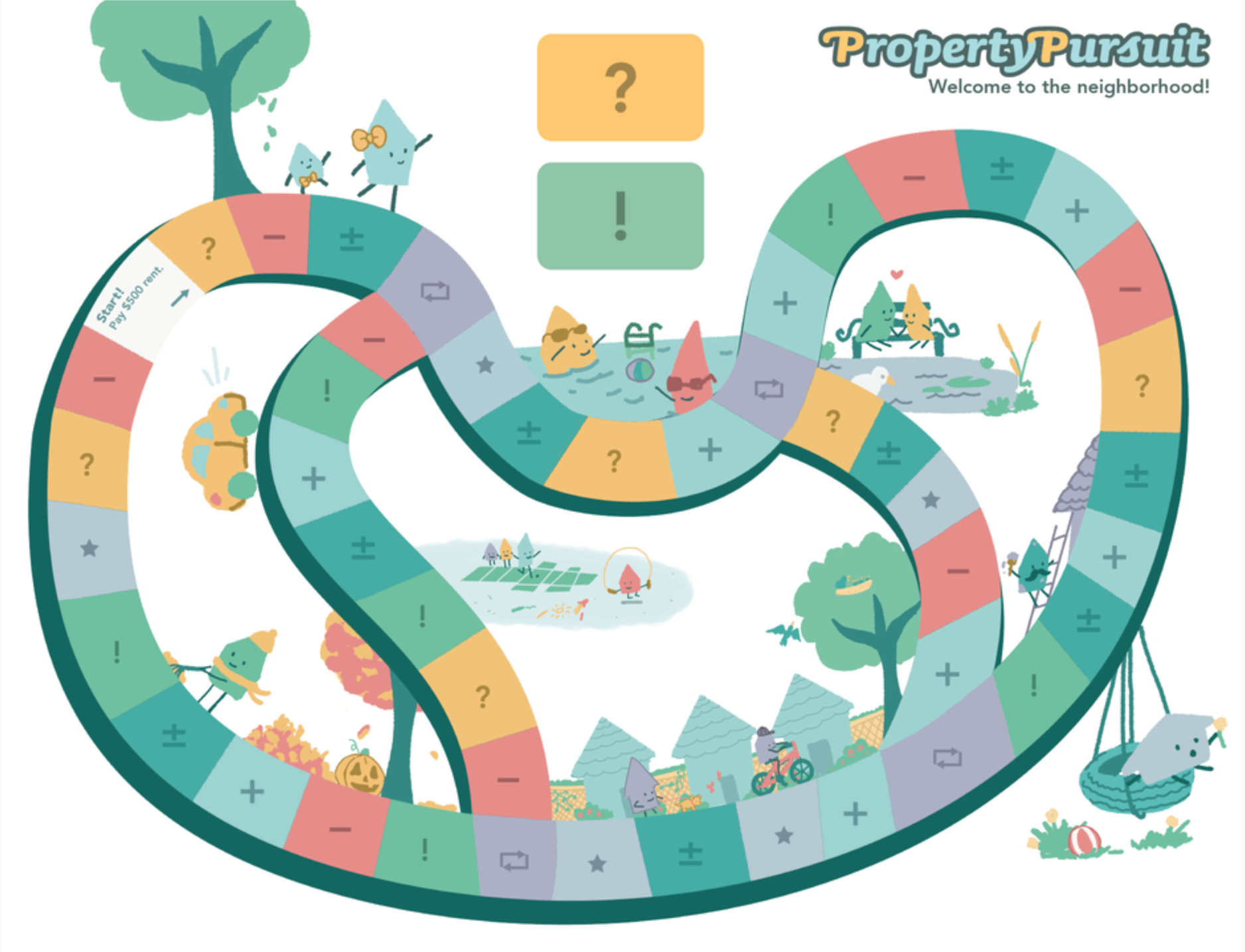
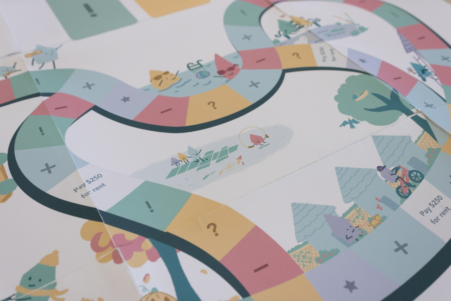
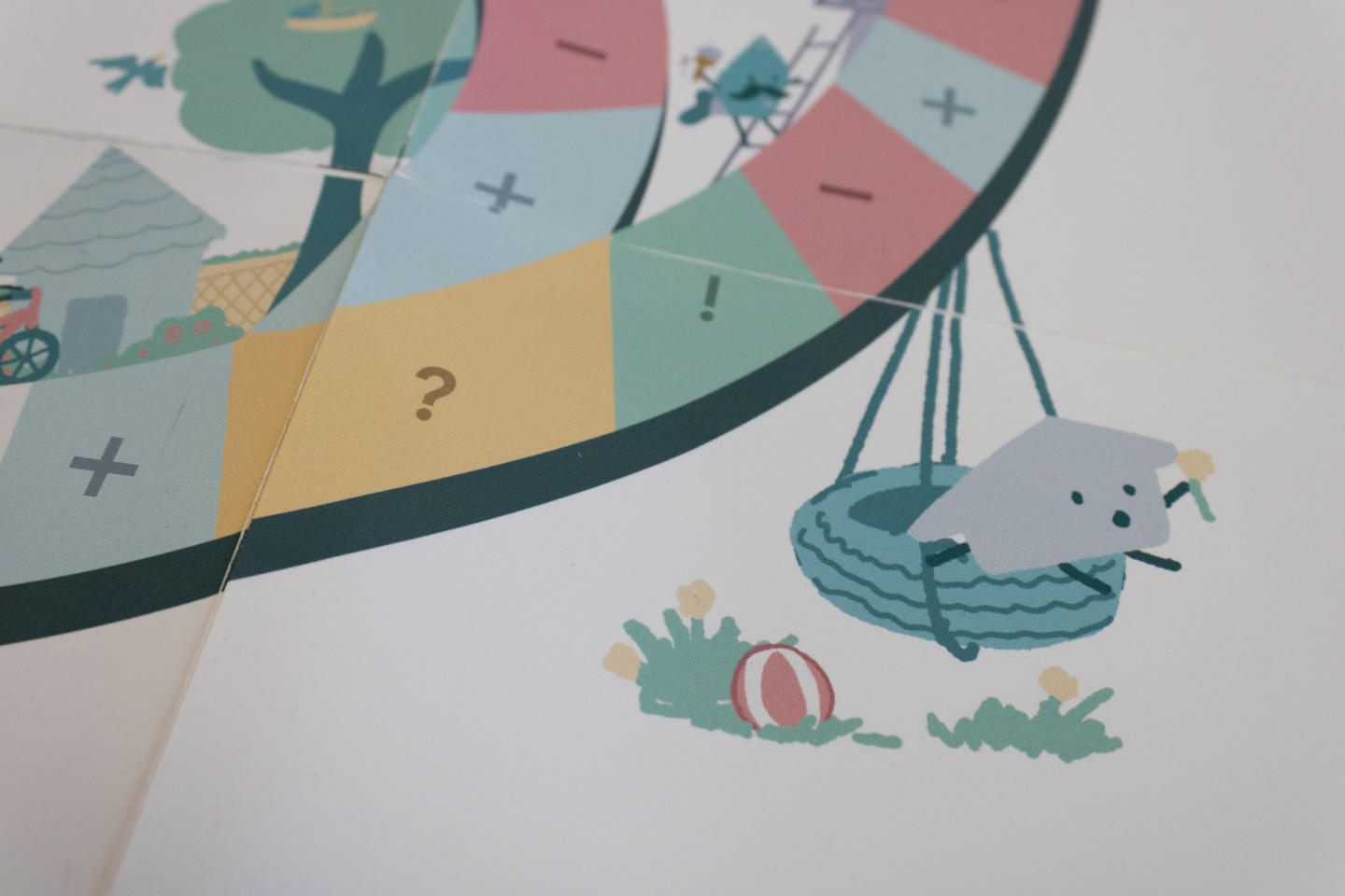
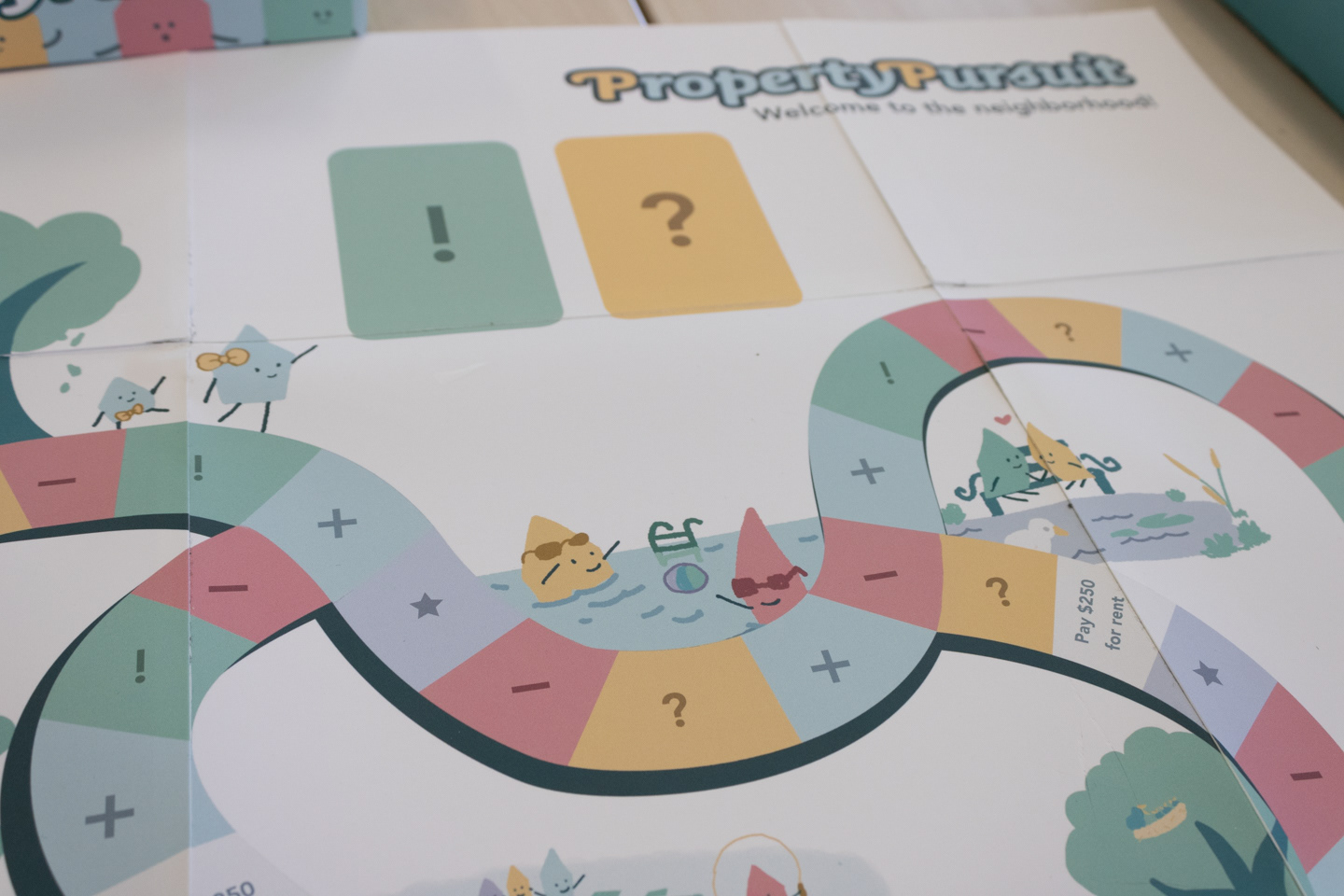
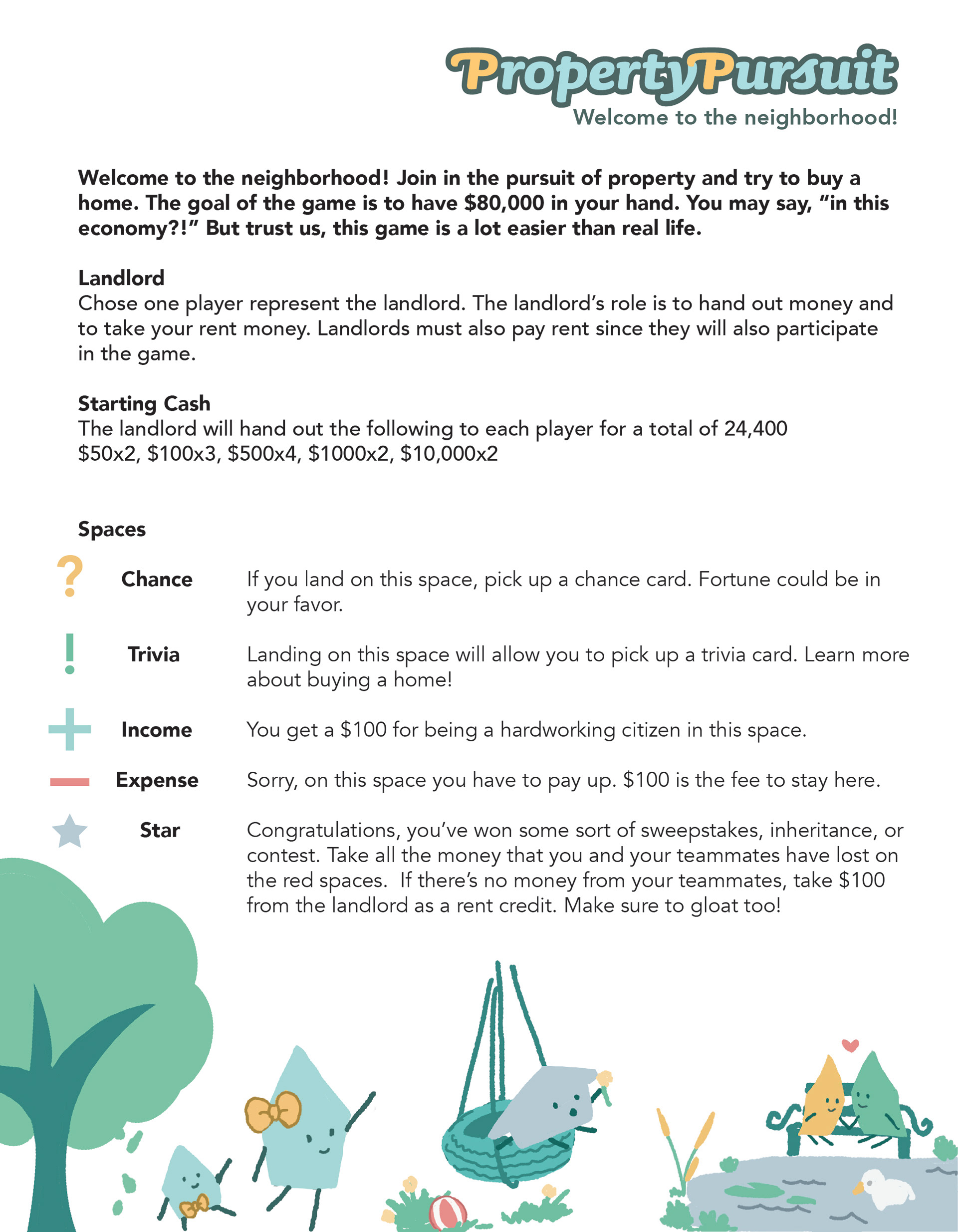
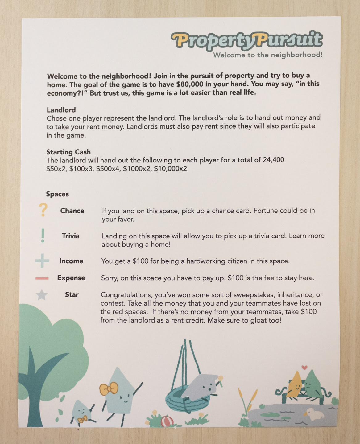
Next in the design process was the game board. This was completed in collaboration with Rocha who began concept development. Based on feedback received from the client, we decided to create an abstract, organic shape for the game's path, versus a square path. Maps and above ground photographs of neighborhoods were referenced in order to design a path that best represented the shape of a neighborhood. The house characters were also sketched doing community activities. The process consisted of switching between both programs based on the task best suited for each program. A written rule sheet was also created using these illustrations.
Box Construction and Wrapping
I also contributed to the project by creating and designing a box to house the materials. The box was created using black illustration board with an insert to neatly fit money, game, pieces, and the board. This is done to transport the game without disheveling the contents. The box is two pieces, with the main content nestled underneath the cover box. To finalize this step, the box was wrapped with designs from Wanlin (top cover), Tracy (bottom cover) and Rocha and I (sides). The logo is included on all sides of the box to ensure visibility when the game is stored.
Reflection
For this project, I had the unique position as team leader and as a member of the design team. I was responsible for organizing the project and ensuring that each member felt sufficiently supported to complete their assigned duties. I also had to ensure that my design work was completed as well. A challenge that I had to overcome was to manage these responsibilities and this was done through delegating work to designers best suited for each role.
